The Evolution of the Industrial Farmhouse
Not gonna lie — We’ve done several different takes on the ever-popular urban farmhouse theme. Each time we tweak it a little. Sometimes we lean into the coastal influence. Other times it’s a Sonoma Wine Country feel. Other times, it’s straight outta Waco and a trip through Joanna Gaines’ brain. This time, we took a cue from the developer’s lighting and hardware selections to bring in an industrial feel.
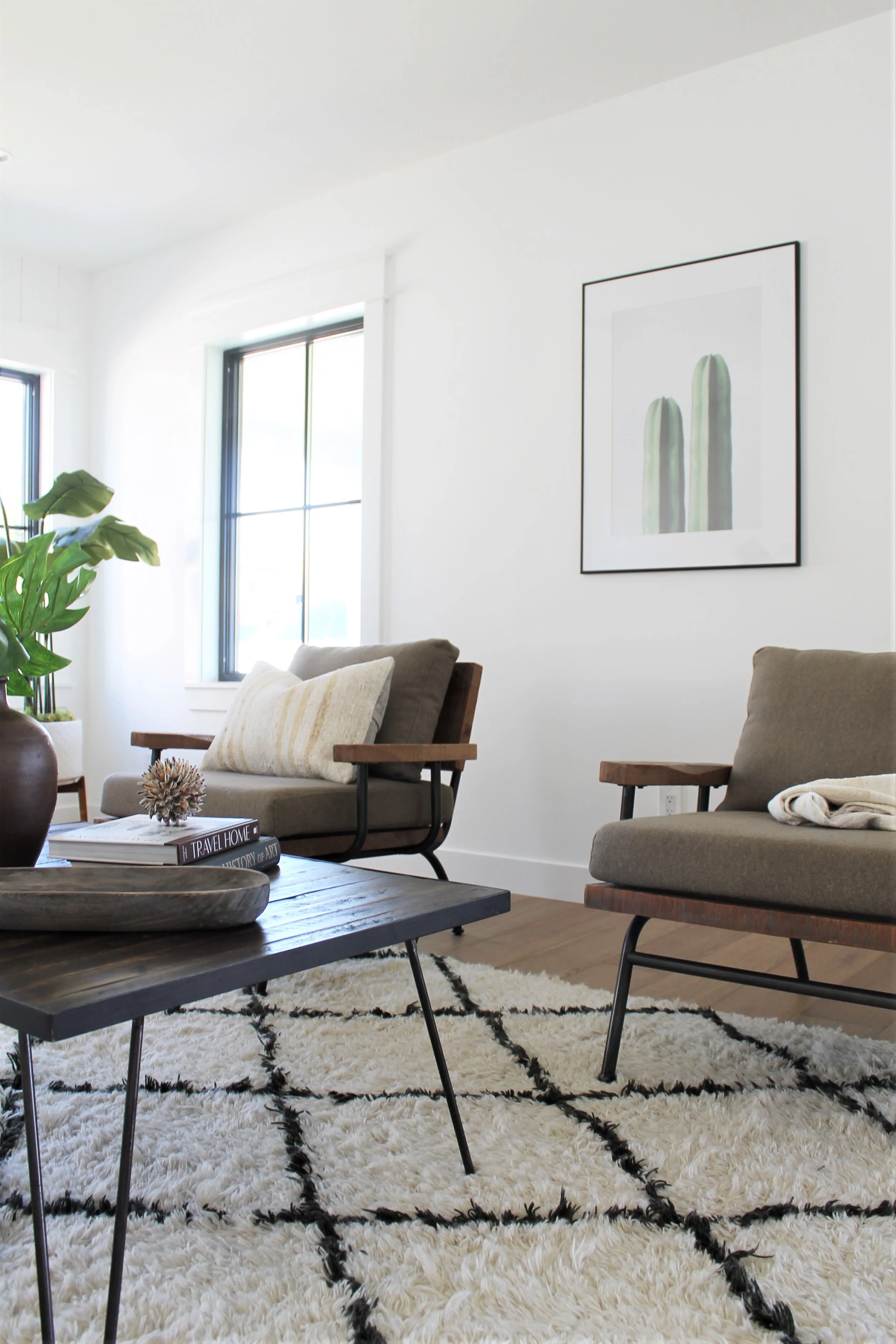
How exactly did we incorporate industrial elements? Thought you’d never ask. We gathered up our reclaimed wood inventory. Now, some of it is actual reclaimed wood, some isn’t strictly that, but it sure has that look and feel. When you tie in a cohesive element like this you can vary your wood tones because they all share one thing in common.
A pair of our rustic wood and upholstery chairs feel right at home in this space, especially when accented with a cozy throw and a handmade wool kilim pillow.
The bold B&W of the Beni Ourain rug pulls in the developer’s color scheme of high contrasts. Art prints from The Printable Studio on etsy bring a cool modern moment — and simplify the oversized linen sofa, while a B&W embroidered pillow echoes some of the rug’s feel.
Black high-back Windsor dining chairs for the win in the dining room. Paired with a lightly weathered dining table in a lighter tone, the chairs bring contrast. Our signature cowhide rug is always a good choice for open floor plan dining spaces. A tall vase we painted off-white using a paint-and-baking-soda technique, a similarly weathered console, succulent art and a fiddle leaf fig pull in the natural world.
A hallway that’s big enough for its own console, lamp and mirror. That’s our kind of hallway. Two original art pieces (we painted over a couple of canvases that were formerly brightly colored) afford a quiet moment on your trip toward the bedrooms.
A little farmhouse moment in the kitchen. The terra cotta-look planter is a West Elm pot that used to have a shiny metallic surface and we toned it down a little with a mix of paint and baking soda.
A neutral primary bedroom always manages to feel both luxe and comfy, especially when you pile the bed high with fluffy comforters and nubby pillows. A vegan leather-topped bench, white shag rug and hefty brass-and-glass lamps finish the tonal design.
Always, always, always choose books with evocative titles when putting them on display in your home — either for staging or real life. We do judge a book by its cover — every single day!
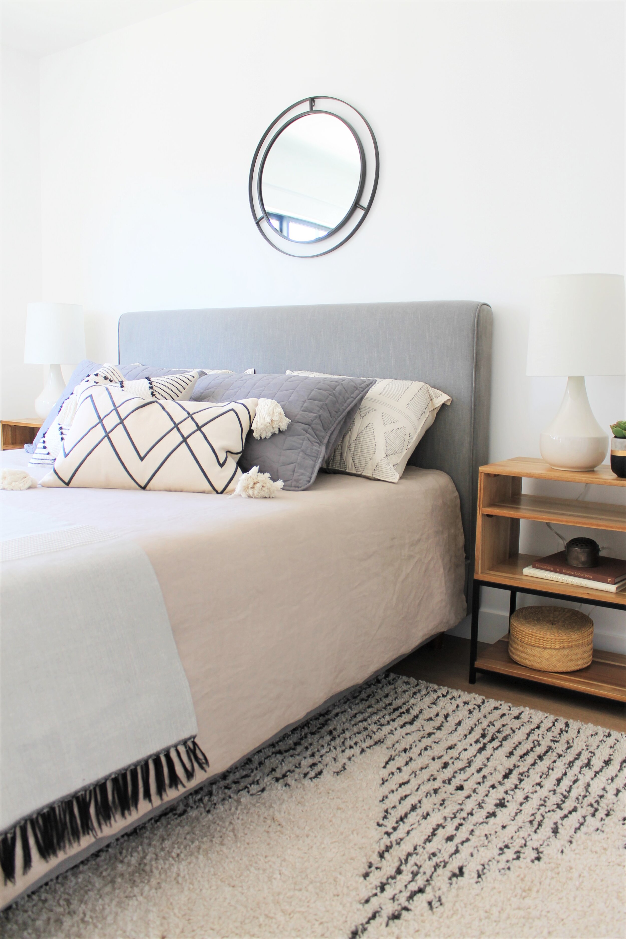
We staged the guest bedroom in a neutral scheme as well, but added a couple of more fun touches — in the form of a bold geometric pillow (the best pillow covers can be found on H&M.com!) a fringed throw and a Moroccan pattern rug.
Our client specifically asked for a nursery — so we delivered a gender-neutral space with textural warmth and a fun spirit.
Lastly, the primary bath with the cutest B&W freestanding bathtub ever. We also love the floor tile. It’s a different pattern than we’ve seen before. We always stage with sea sponges, loofahs, Turkish towels and bath brushes. And here, a small woven stool holds a few necessities.


