Bright and Happy Mt. Washington Home
There was so much to love about this home staging project. First off, one of our fave developer teams did the remodel and secondly, the Mid Century modern home was tastefully renovated with a great eye for detail, a hallmark of this particular developer. Also, our clients hired us because we’ve partnered with them successfully several times over the years and they had a specific look in mind — complete with inspiration photos. This is unusual in the world of staging. But we trust this design-build team because their designs have never disappointed! It became a fun challenge to create our own design plan that took into account everything on their wish list. Bright color-blocking. White and light furniture. Mid Century style. Solid colors, not a lot of pattern. Armed with their visual and written requests, we headed to our warehouse to pull only those pieces that would fulfill this vision.
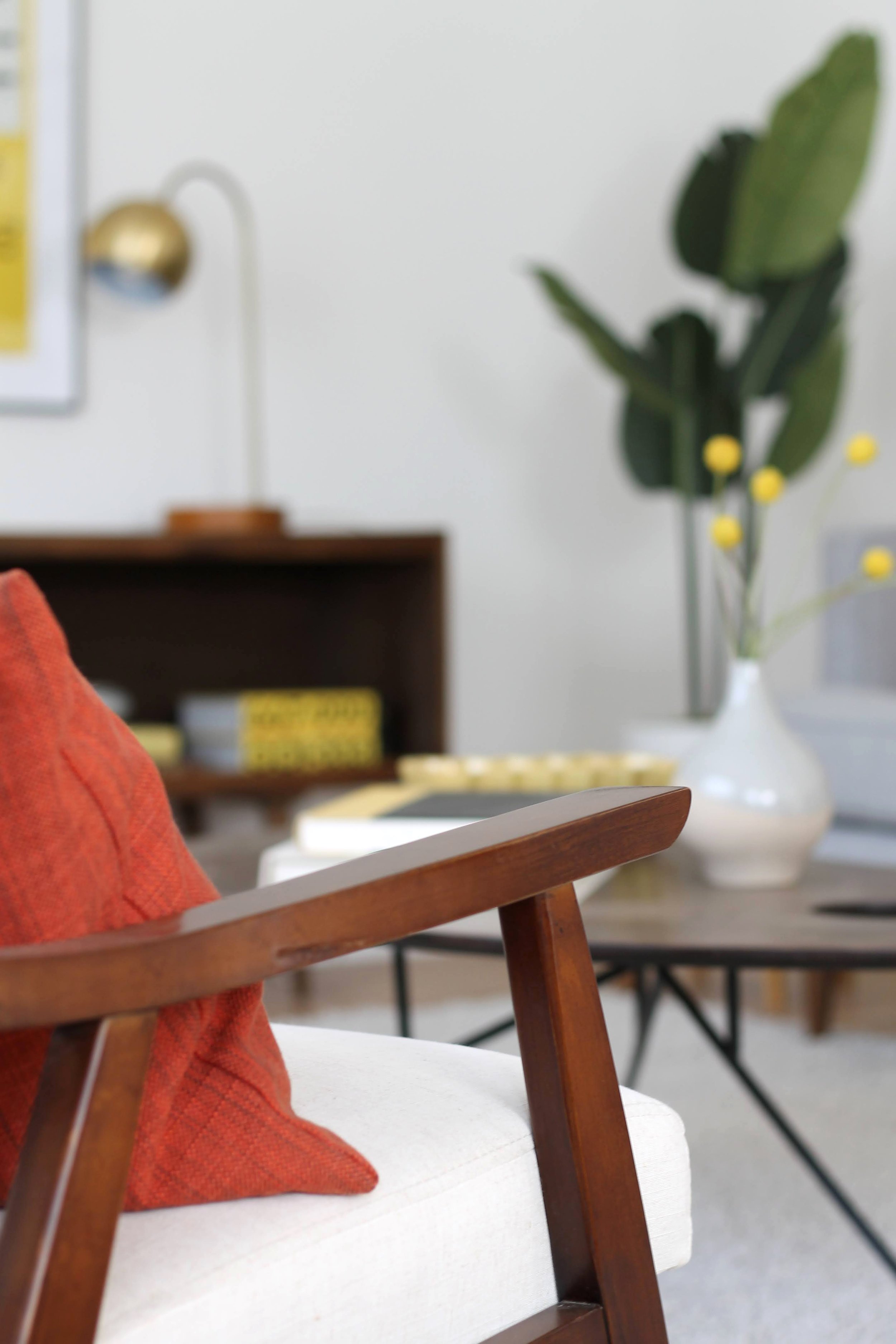
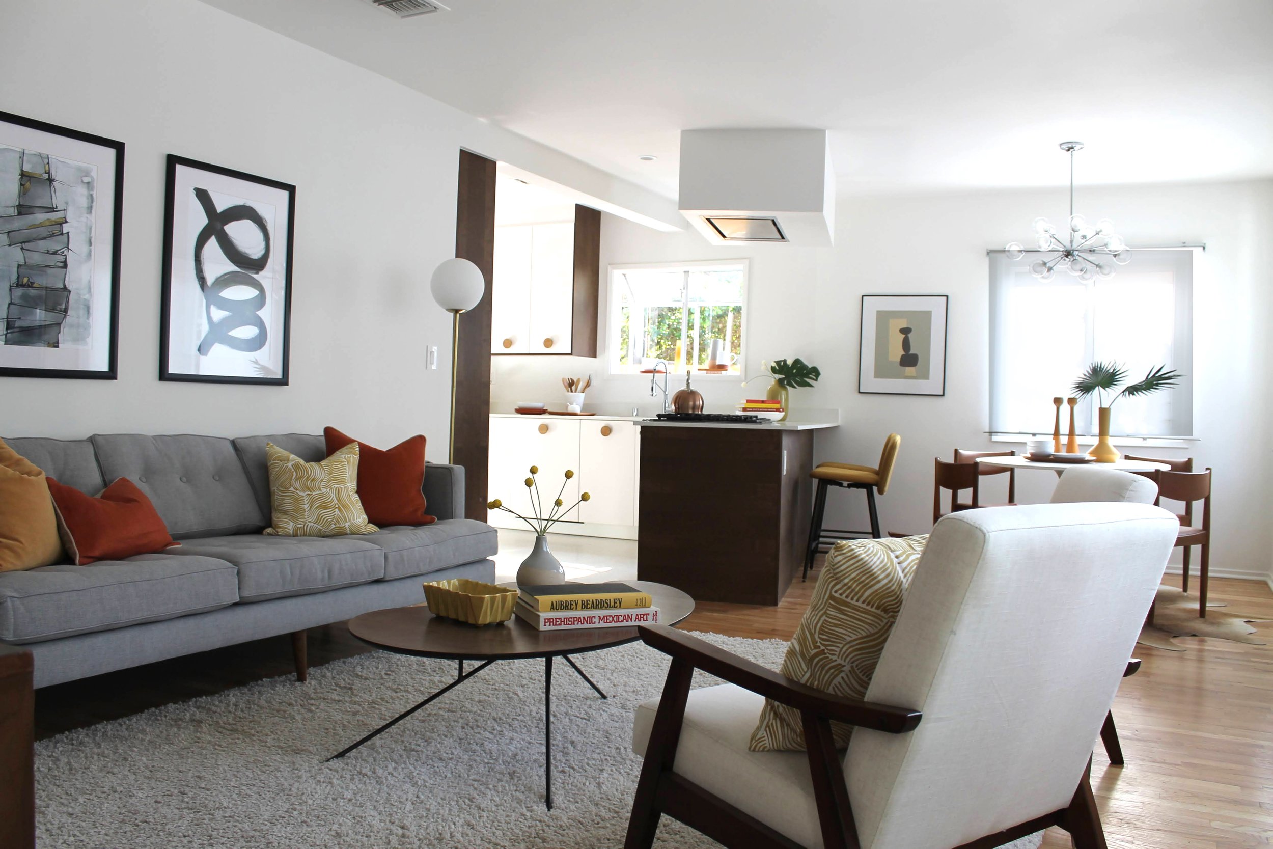
Red-orange and ochre came to mind immediately. We knew we could pull off this look if we began with a happy mix of these colors — with a few surprises thrown in. Since we wanted a fresh base layer, we first brought in a white shag rug. We knew it would lay the foundation for the brightness we had in mind. Off-white upholstered MCM chairs with wooden frames would fill the bill for living room armchairs. And West Elm’s Peggy Sofa in a light gray would anchor the space.
Utilizing a less-is-more philosophy, we put our artist’s palette-shaped coffee table to work serving the seating area with its narrow metal legs. Atop the table, some vintage ochre pottery, coffee table books and a happy sprig of pom pom flowers in bright yellow. It’s amazing how such a small touch can add just the right cheerful note. Once we got started it was so easy to spread the cheer throughout this home. For a moment of graphic impact, we hung abstract art in B&W and soft ochre.
The dining area was the perfect spot for IKEA’s DOCKSTA table, paired with a set of four vintage leather and wood dining chairs. A cowhide rug underneath it all defines the area and brings an organic shape to the room. Vintage Mid Century wooden candlesticks, simple bowls and plates and a teak tray set the stage for one lucky buyer’s potential breakfast area. Pulled up to the kitchen peninsula is a set of ochre counter stools, giving us the opportunity to bring our fave yellow tone to the scene in a meaningful way. On the wall, a Matisse cutout-style DIY collage (a cheeky nod to the artist who is also featured in the living room’s framed poster).
Soft light emitting from the white roller-shaded windows falls on the simple styling employed here. In modern stagings, we keep it spare and impactful.
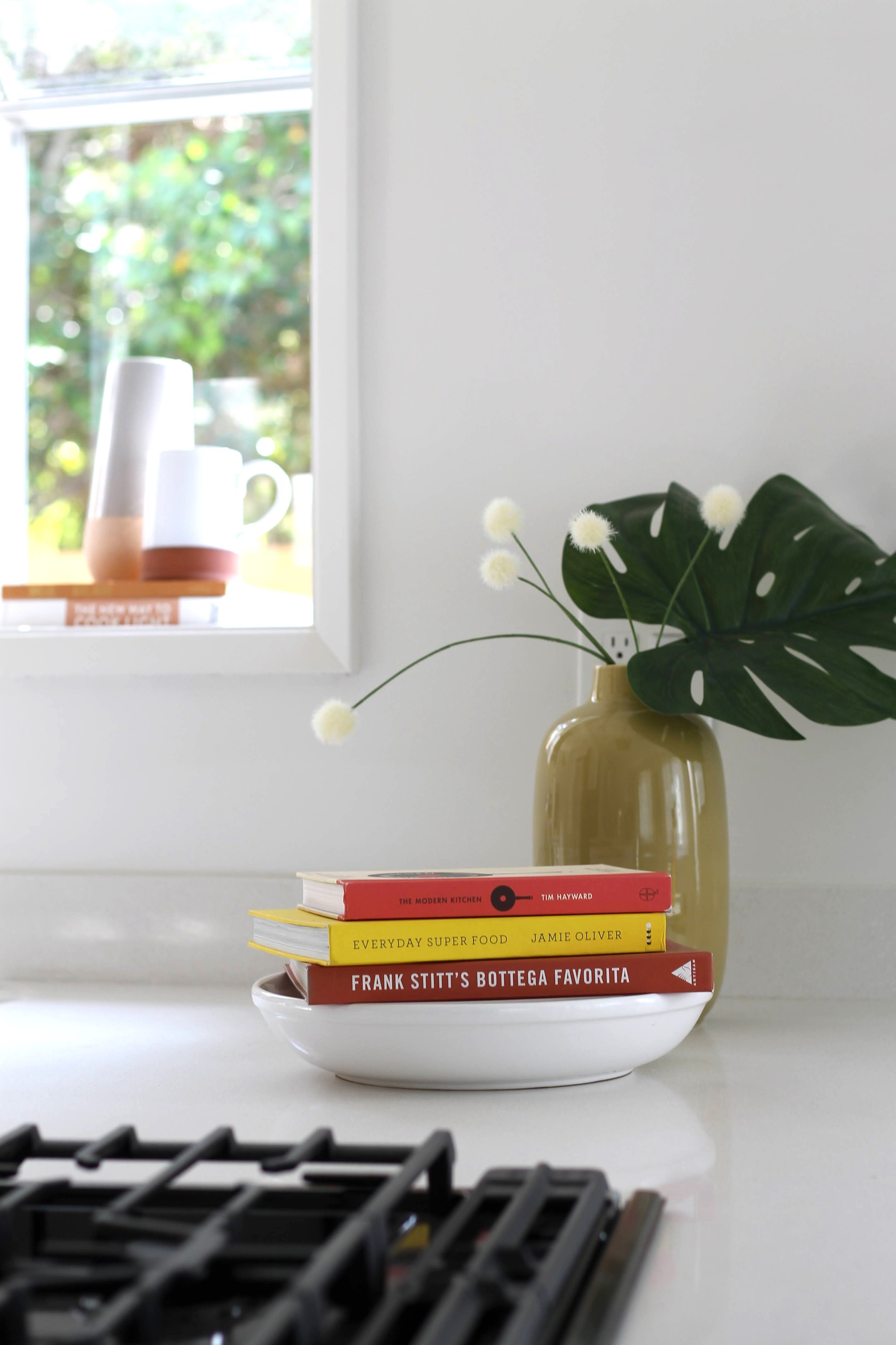
We’re pretty sure that our most-used kitchen staging accessory would have to be the cookbook. We have an entire bookcase in our book room filled with nothing but cookbooks — in every color, size and length. Next up on our faves list would have to be a canister of wooden spoons and spatulas, followed by teapots. Something about a teapot conjures up thoughts of a steaming cup of tea on a cold morning. OK, so we don’t get many of those proverbial cold mornings here in LA. But a girl can dream, can’t she?
Is there anything cozier than a mohair throw with fringe? No. No, there isn’t. A fresh snowdrift of white linen bedding sets the stage for this quiet moment. Yes, these moments are EVERYTHING when it comes to staging. Full disclosure: We sometimes encounter over-zealous realtors neatly folding our throws and placing them at the foot of the bed. But honestly, we love the casual “I just ended up here” look when you toss these babies with abandon.
Work from home, home office, homework station or just a little place for your laptop. Whatever you call a desk and chair, these days nothing goes over quite as well to show potential buyers that the daily trudge into the office may not be necessary. Or that your kids may finally have that dedicated homework station you’ve always dreamed of. Even if you take this set-up and turn it into a vanity (by replacing the art with a round mirror), a spot like this is good as gold.
With all the warmth in this home, we decided to make one guest bedroom a respite of cool color. In this case, teal plays well with the ochre-and-orange we used in the common areas. Keeping it simple and sumptuous, puffy comforters pile onto this gray upholstered bed, while a bright patterned rug invites bare feet to sink in. Just one teal velvet pillow and a softly patterned comforter folded at the foot (both from CB2) are all that’s needed to tie-in to the rug’s hues.


