A Fresh Take on Transitional Style
When we first decided to add transitional style to our staging lexicon, we had just been hired to stage a penthouse unit in Hollywood. We knew this home would require a more measured approach and a classic, shall we say “expensive” look. We had also just come back from an intense staging seminar and were evaluating our design portfolio for new opportunities.
One market that appeared ripe for us to take on was the approx. 2,000 square foot new-build home with an open floor plan. The type of home that requires a large white linen sofa as an anchor, rugs in fresh natural materials like seagrass, larger-scaled armchairs and commodious console tables on which to rest hefty gourd lamps and rustic wooden bowls.
We jumped into this challenge by sourcing roughly one home’s worth of transitional pieces, knowing that these would span from transitional to modern to traditional should the need arise. And it did. Many times, in fact. We quickly discovered that our transitional pieces were exactly what the doctor ordered — clean-lined, not trend-specific, highly useful and just enough of a “blank slate” to work everywhere. Now, fast forward to 2021, where we find every major retailer embracing a transitional Post-Modernist aesthetic. CB2, Crate and Barrel, Living Spaces, Target, Urban Outfitters, Walmart — even West Elm is getting in on it. Formerly the purveyors of spindly MCM furniture, West Elm has jumped on the transitional bandwagon big time. A look at their most recent catalog shows a grown-up sensibility and classicism one wouldn’t expect from this big box store.
One theory we have that may explain the rise of this “adulting” trend in interior design is that the Millennial generation is reaching age 40 — with good jobs, kids in grade school and ready for something more comfortable, durable and decade-spanning. Millennials make up the greatest portion of people buying their first home — and they want their first home to be a “keeper.” Space, amenities, a sense of tranquility — all of these factor into home buying decisions. And with the advent of Covid-19, lockdowns, work-from-home situations and home schooling, families want room to really “live” in their homes — space for TV watching, a home gym, meditation or yoga area, meal prep and cooking, spacious primary suites for alone time and backyards big enough to build that pool. Someday.
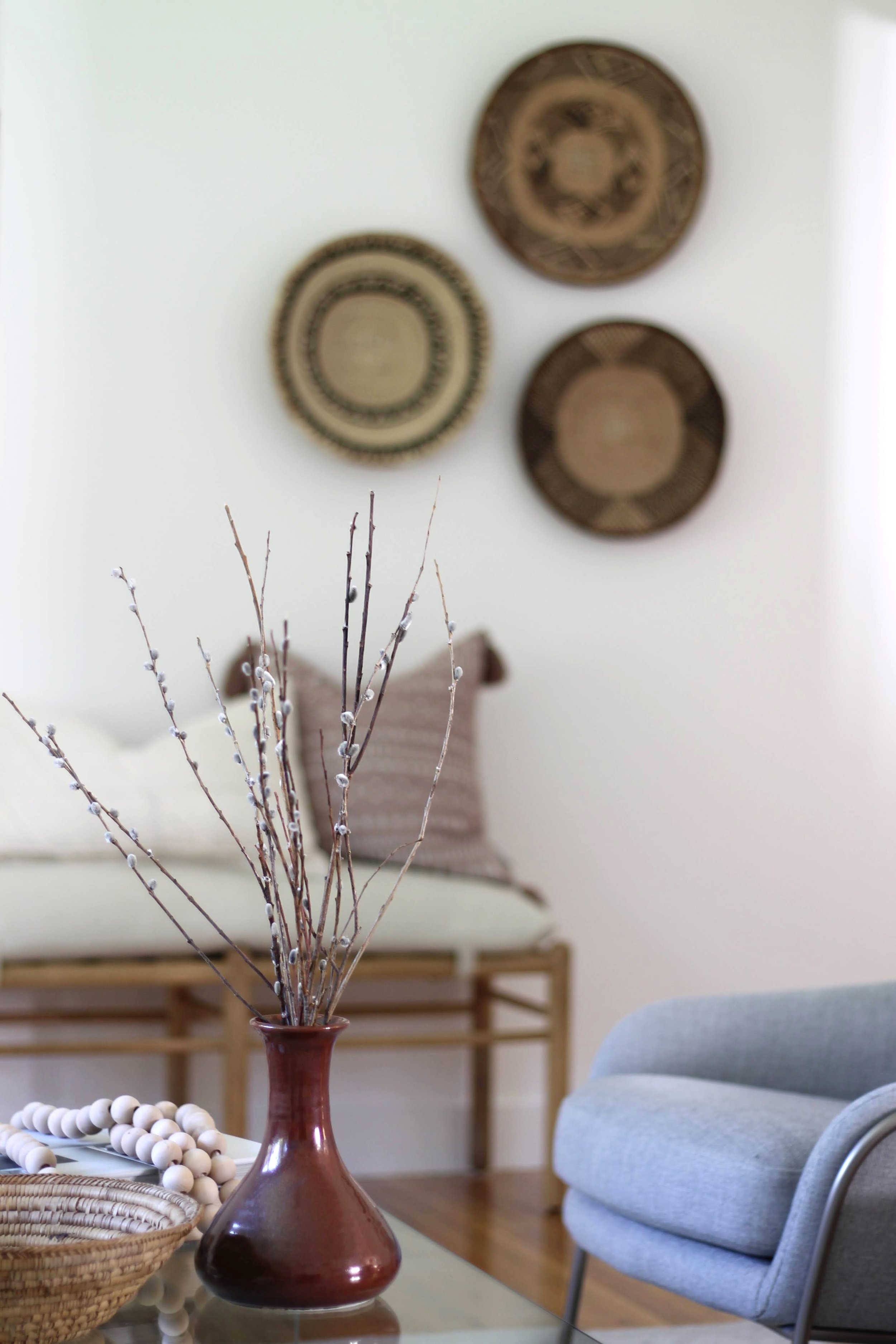
All of these considerations are top-of-mind for us when we stage a home. That’s where our attention to detail comes in, and why it’s so important. Something as simple as a spray of winter twigs in a November staging matters. It matters a lot. A trio of baskets on a wall bring warmth, a muslin-covered bench in the newest light wood tone has just enough charm to read farmhouse — but with a blush fringe pillow atop, just reads “home.”
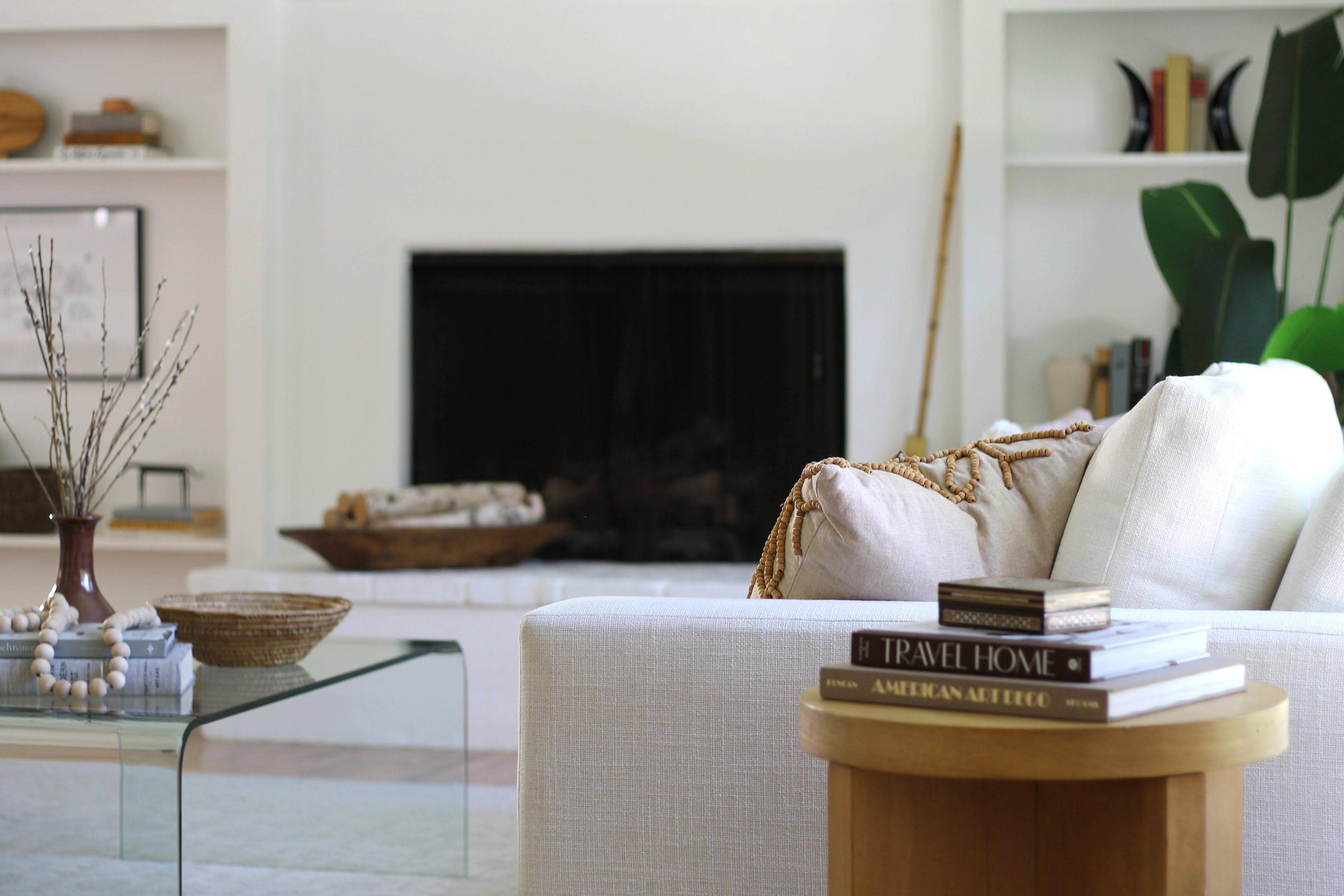
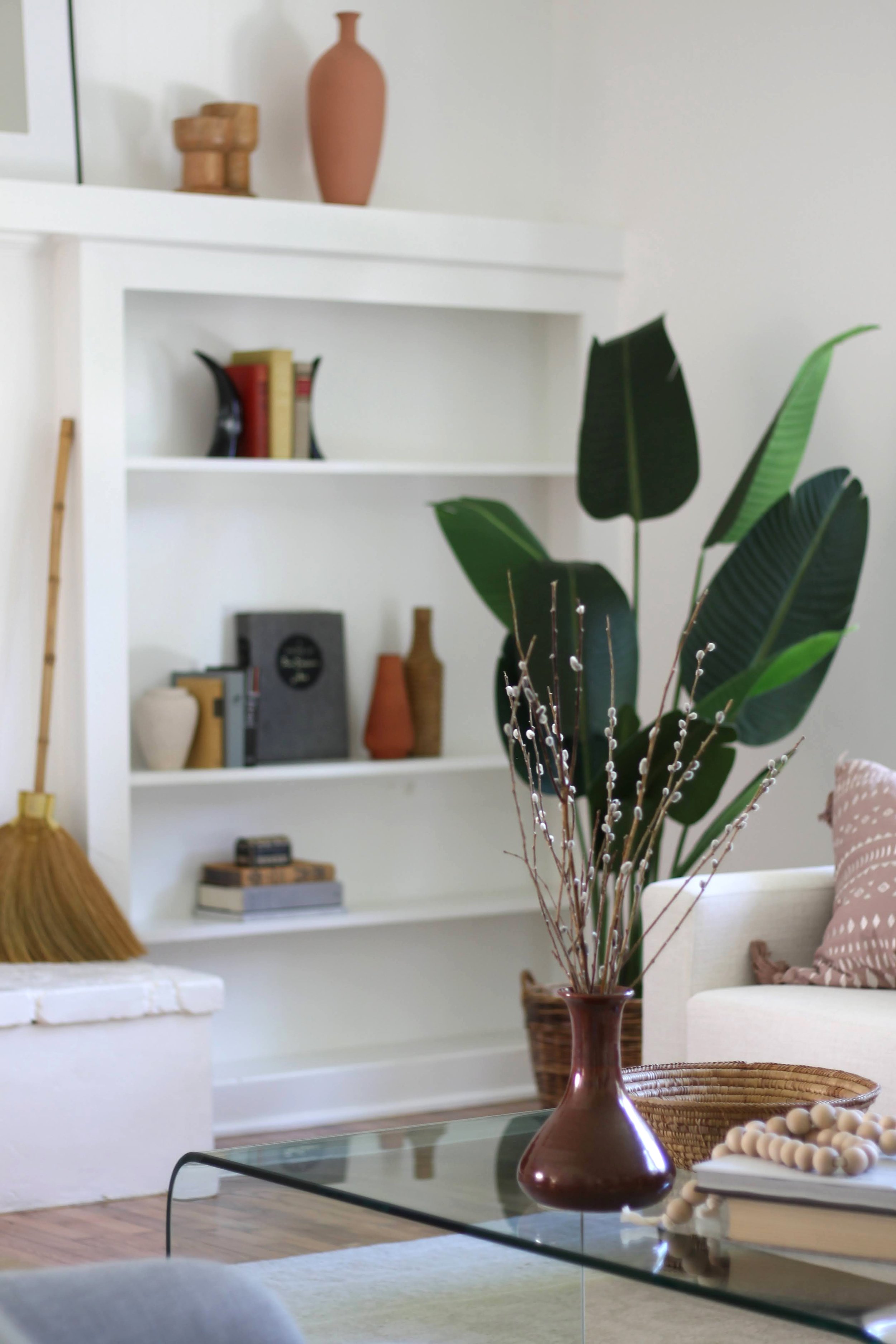
The flipside of the living room shows the charm of fireplace built-in shelving — one of our absolute fave features in a home. When we see built-in shelves during our first site visit, our hearts flutter just a little. This is why we have shelves and shelves in our warehouse of interesting objects and books — to fill bookcases like this. A glass waterfall-style coffee table practically disappears, showcasing the fascinating objects on its surface.
With all this talk of transitional style, it’s important to remember that one of the best ways to work within it is to work against it. What do we mean? These lounge chairs from West Elm have a distinctly modern feel. Chrome base, light gray upholstery, swoopy lines. How best to mix it up when your goal is transitional style? Add something that’s decidedly modern. Do it unapologetically. Take a transitional sofa in white linen and pair it with the unexpected — try a Barcelona or Eames lounge chair. You’ll be amazed at how well these disparate elements “converse” with each other. This is why we love all things transitional — and why they’re the strongest, most-used items in our inventory. We can’t leave this photo without mentioning that fab Studio McGee for Target side table in light oak — the “it” wood tone of 2021.
What accent furniture is best to add to transitional? Think nature and global. The faux tree trunk side table addresses nature, the vintage kilim pillow brings global style to the conversation. Add an original large free-form abstract painting to the mix and you’ve covered all your bases. A glimpse into the kitchen shows a set of leggy counter stools with organically shaped wooden seats for a combination of man-made and formed-by-nature. Once you start to play in these worlds it becomes second nature. See what we did there?
An industrial style round dining table pairs with rounded Scandi-modern dining chairs, proving once again that transitional loves modern. If you keep your color palette simple and mostly neutral, you open up a world of possibility for styles — and decades — to mix and match quite happily. We love the little glimpse into an awesome home office for those who work from home — complete with your own small sofa/daybed (the Studio Sofa from Room + Board), which we’ve styled for sitting or just downright sleeping.
We always say, give us 60” of wall space and we’ll give you a home office. Really. It’s all you need. Here, a Mid Century modern style desk tucks into an unused corner and suddenly it’s transformed into a homework space or laptop perch. A gooseneck lamp keeps your eyes from straining as you peruse banana bread recipes online or catch up on your favorite YouTuber. The desk chair and occasional chair on the left are from Target’s popular Studio McGee line. We stocked up on our favorites and we’ve been playing with them a lot lately.
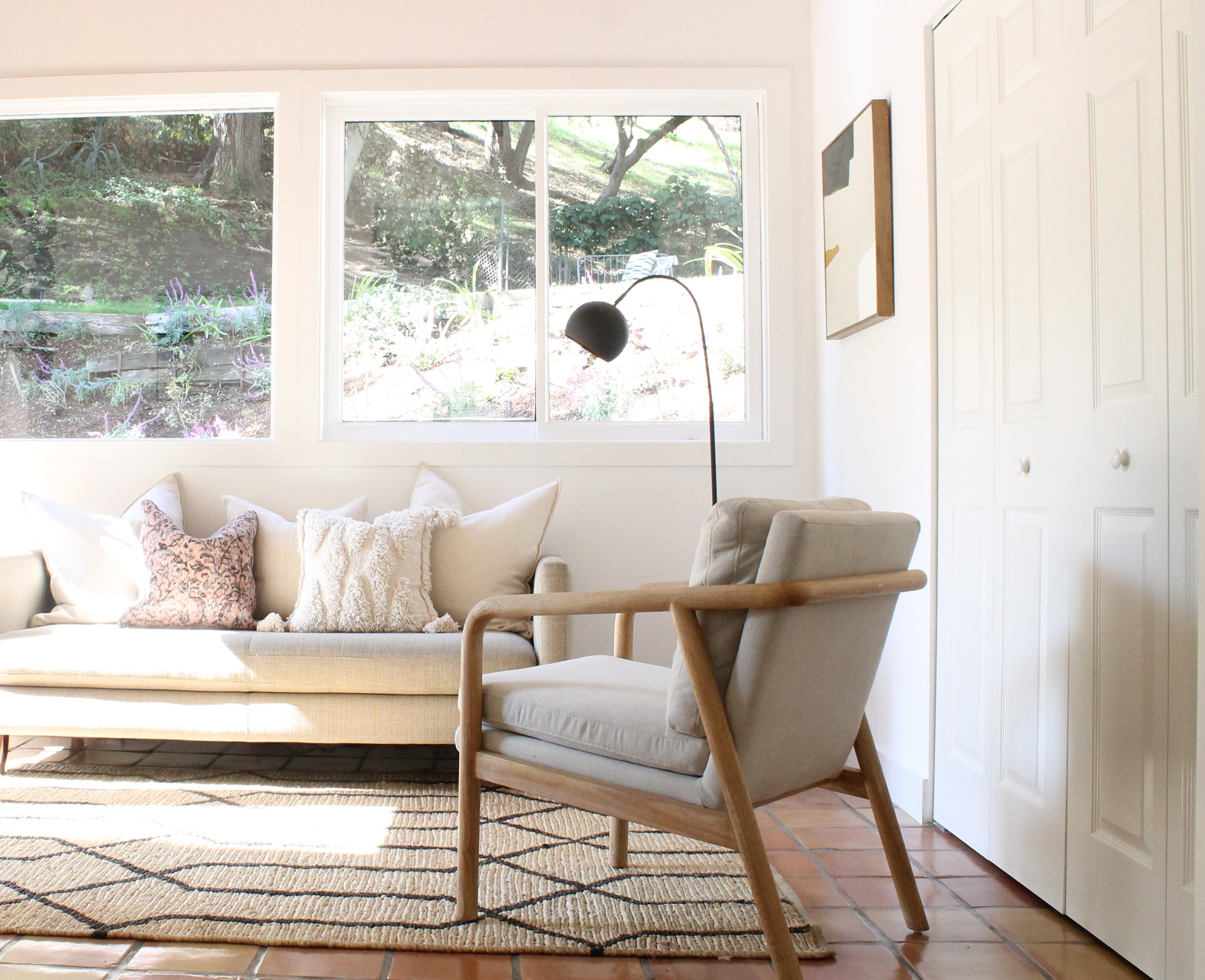
Large windows let in copious amounts of light in the home office, while Saltillo tiles feel cool against bare feet in the summer. A simple jute rug covers you for cooler months. DIY abstract art adorns the walls. We buy stretched canvas art on FB Marketplace sometimes and paint it over — This can be done numerous times. If you grow tired of one color scheme, get out your paint brushes and paint it again!
Kitchens deserve love too — and we know how important they are to potential buyers, which is why we maintain an extensive inventory of charming and stylish kitchen accessories, from bowls and cookbooks to wooden spoons and rolling pins, we’ve got everything to outfit a kitchen for today’s buyers. Glass-front cabinets afford us the opportunity to display some of the crockery, plates and dishes we’ve acquired from over a decade of collecting. You could call us hoarders. But if everything is really nice and it’s neatly organized, categorized and stored, is it really hoarding? OK, maybe it is, but if it’s wrong to hoard, we don’t want to be right.
The primary bedroom in this home gave us the opportunity to work with one of our fave headboards — The Shelter bed from West Elm in dark indigo. Since it’s just a headboard, we used a matte black metal frame for the bed’s foundation. We love the low profile of this bed and we added a yummy fluffy white comforter at the foot for height — and pure coziness. Warm textural lamp bases, mirror frame and woven foot-of-the-bed ottomans offer a triad of basket-toned goodness.
To be totally honest, staging kids’ rooms rocks. It’s still the most fun even though we stopped being kids quite awhile ago. But as soon as we start planning a kid’s room in a staging, face it, we’re all just five years old again. Hand-painted terra cotta lamps set a blushy pink tone for fun rattan furniture, a pair of white metal nightstands, pastel blue patterned rug and animals — both ceramic and plush. The cat’s face mirror is from H&M Home. Too flippin’ cute.
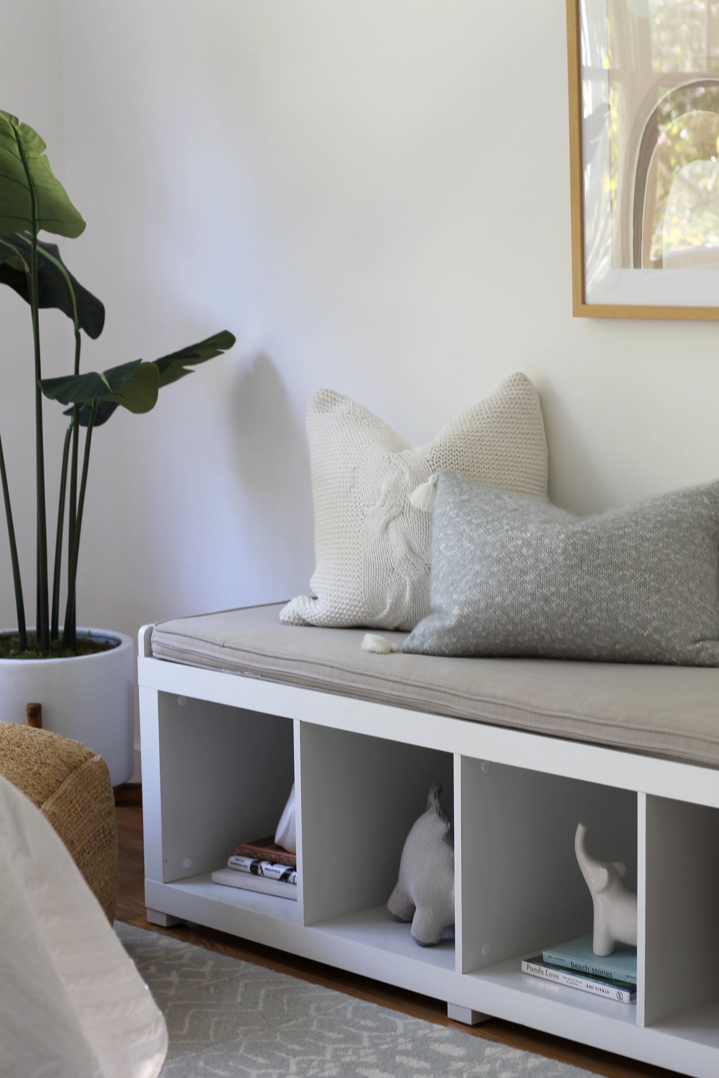
Every stager should own a white cubby bench. Imagine the options. Plenty of room for kid books, stuffed animals and toys — plus a comfy cushion on top for a quick book-read with Dad or a lesson in shoelace tying with Mom. If a home has at least one designated kid’s room, chances are there’ll be a child touring with their parents saying, “Mommy, mommy, I want this room! Can this one be mine? Pleeeeeeeeeeeze!”
