salon style property staging
 alon style can be described as a European sensibility applied to a social space that promotes intellectual conversation and an appreciation of the arts. Salon style is always slightly clubby, a bit decadent and decidedly Parisian. It feels not merely rich, but absolutely exudes wealth. We had the opportunity to stage a home in a classic salon style in the last two days. This Glendale home sits atop a knoll in the Verdugo Woodlands area, surrounded by traditional character homes dating from the 1930s and ’40s.
With its dark wooden beams and white paneling, this home whispers comfortable elegance, and the homeowner’s eclectic and stunning collection of art graces each wall. Fine English antiques and Asian artifacts filled the home, but were lost in the overly cramped rooms.
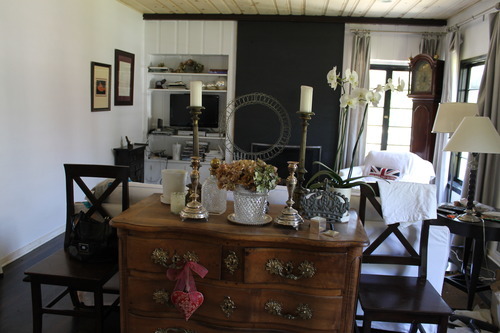
LIVING ROOM BEFORE
LIVING ROOM AFTER
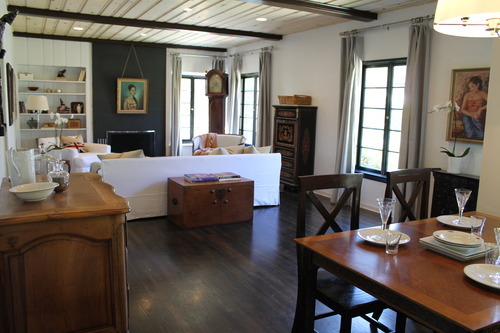
We opened up the space by moving furniture to logical spaces within the rooms, each piece getting the greatest display potential. We repositioned the dining table to make the dining area appear larger and took the top trunk off an antique piece to create a perfect behind-the-sofa table.
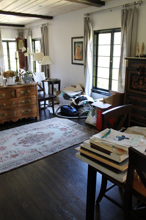
LIVING ROOM BEFORE II
LIVING ROOM AFTER II
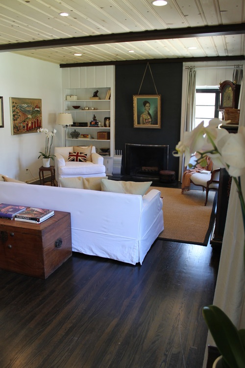
By removing the back cushions from the white slip covered sofa and chair we created a clean sight line into the living room. Carefully chosen art pieces and the repositioning of key pieces of furniture show the room at its best advantage. Space planning is especially important when staging an occupied home, as you will always have to move furniture to create better flow.
LIVING ROOM BEFORE III

Of course, life happens. Kids leave their toys in the living rooms of real people. But staging is all about creating an illusion.
LIVING ROOM AFTER III
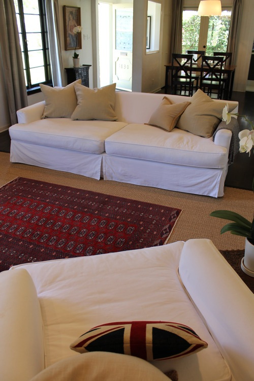
The illusion that all is serene and in its place, there are no chocolate smudges on the sofa and the kids’ toys have magically disappeared. Large burlap hued grain sack pillows offer a casually rough contrast to the antique rug. Underneath it all, a nubby sisal rug with a dark border.
DINING ROOM WALL BEFORE
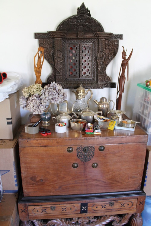
An amazing treasure chest of antique artifacts covers the top of this chest. While individually beautiful, together they form more of a visual jumble for a potential buyer who may have trouble seeing past them to the home’s positive features.
DINING ROOM WALL AFTER
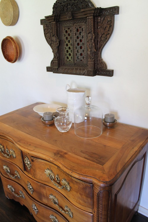
We moved the imposing English antique dresser from its original position behind the sofa to a more size-appropriate location across from the dining area to serve as a buffet in place of the existing chest. A simpler display is featured on top and the stunning altar piece remains above, but now you can really appreciate it.
MASTER BEDROOM BEFORE
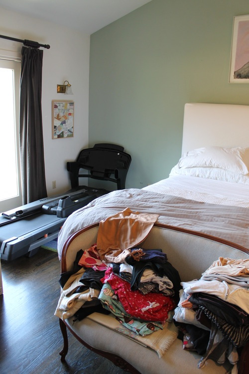
We all have them… the exercise machine that often goes unused, the handy foot-of-the-bed bench that serves as a laundry sorting area, and the casually placed artwork that we “always meant to hang properly.” It’s all the stuff of life, but when you’re trying to sell your home, your master bedroom should be a retreat worthy of a fine hotel, with fluffy white bedding and sink-in comfort. The settee you see peeking out from under the clothes was so awesome that we rescued it from its dwarf-dom by the king-size bed and placed it front and center in the living room.
MASTER BEDROOM AFTER
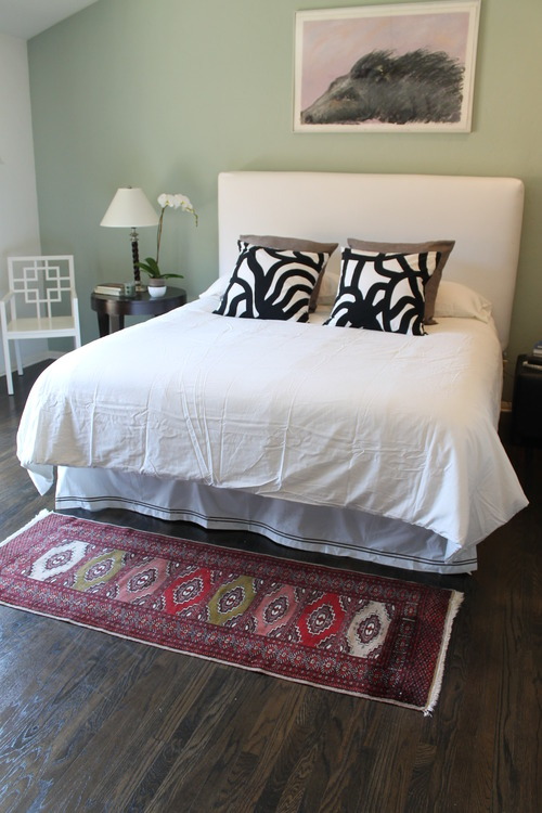
We think the horse art above the bed is pretty amazing. And with the settee moved, we could place a Persian rug at the foot of the bed for some warm color.
LIVING ROOM SHELVING BEFORE
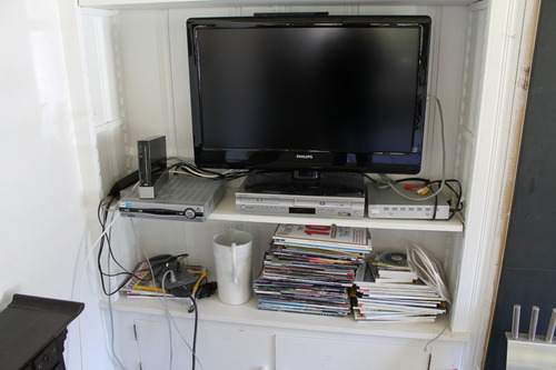
The display potential of the white built-in shelving in the living room was completely untapped until the homeowner removed the TV, all its cords and attendant paraphernalia.
LIVING ROOM SHELVING AFTER
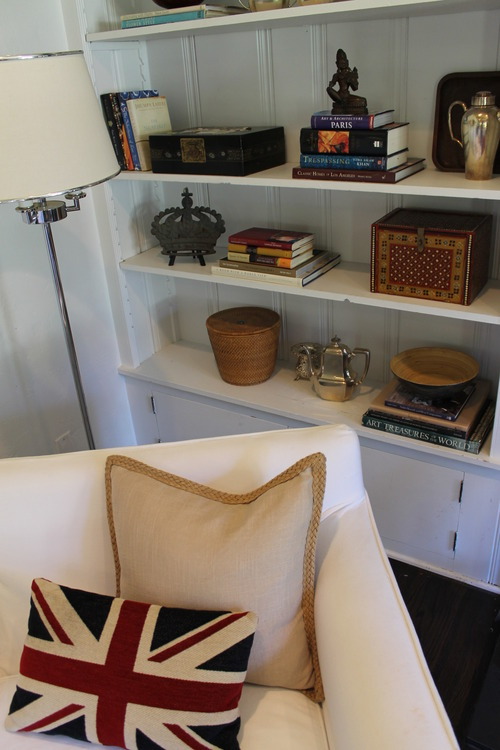
This allowed us to work with her eclectic accessories for styling. Magnifique!
AND NOW FOR SOME DETAIL SHOTS…
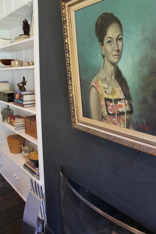
A vintage portrait of the homeowner’s mother now graces the stunning black matte finish granite fireplace. We love how the rich teal plays against the graphite background. We hung it from a leather cord on a nail high above for added drama.
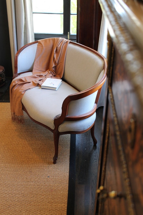
That settee from the bedroom has found a new home tucked into a windowed corner near an antique grandfather clock. In the foreground, an exquisite hand-painted Asian chest.
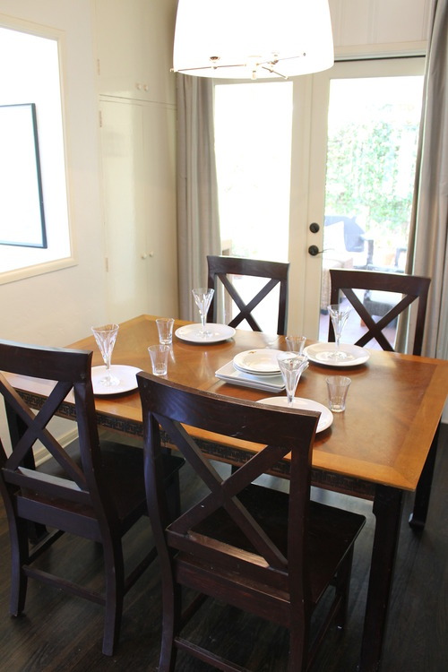
Moving the dining table and chairs perpendicular to the entry’s half-wall brings more attention to their simple beauty. French doors open to an enticing patio.
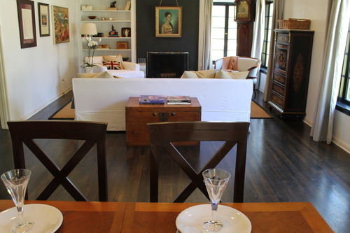
A view over the dining table into the living room shows how the whole space planning worked. Large art pieces fill formerly vacant wall space on the left to create the feeling of a larger room.
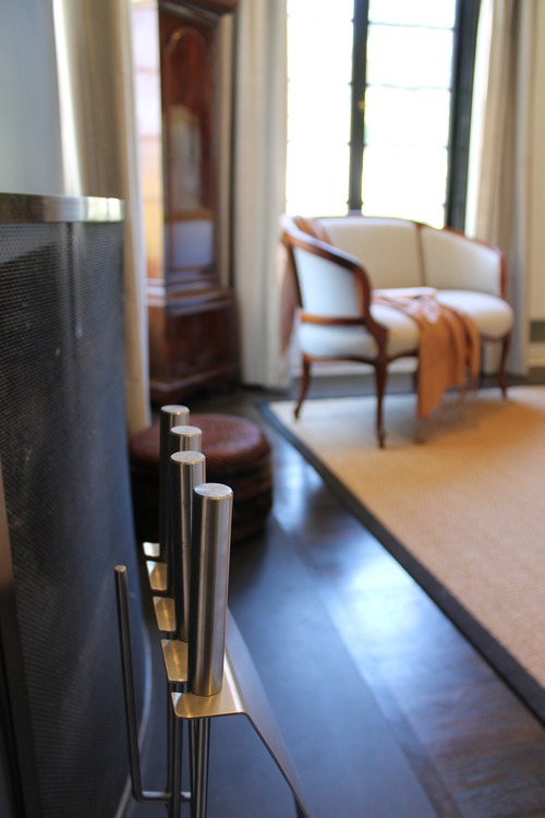
Brushed stainless fireplace tools in the foreground juxtapose against the elegant settee with a casually tossed pashmina throw and the book “French Woman Don’t Get Fat” atop it suggesting an afternoon of reading.
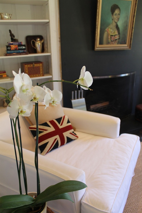
We love the graphic punch of the Union Jack pillow against a white slip covered chair. The homeowner purchased the pillow at the Buckingham Palace gift shop. Must get one!
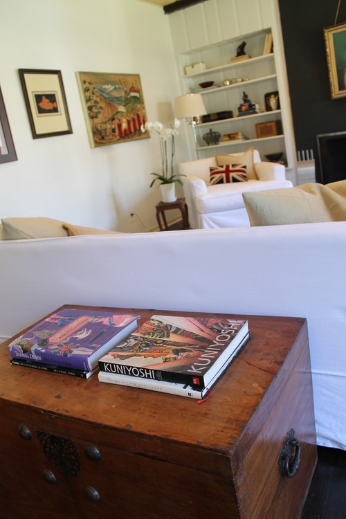
The top half of an antique chest serves as a stand-in for a coffee table. Since it’s home staging it doesn’t have to be entirely practical. But one must always have fabulous coffee table books, whether they reside on a coffee table or a re-imagined chest.
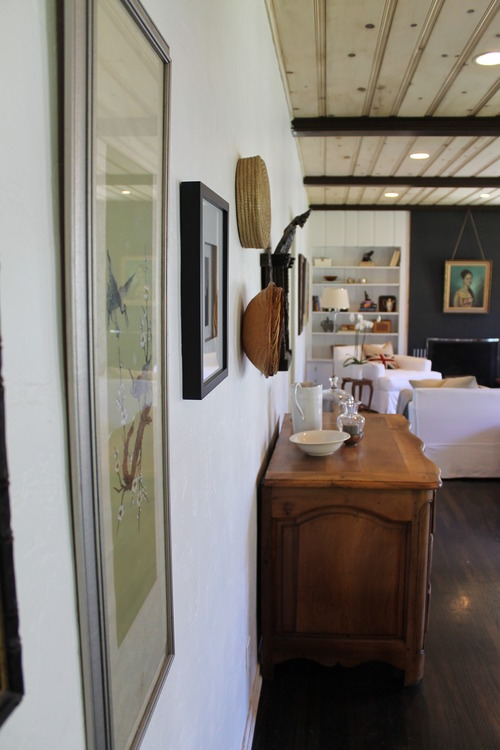
We created a gallery wall in the dining room with eclectic art and baskets. The top basket is actually hiding a less-than-beautiful bare light-bulb sconce. Yes, we simply smooshed the basket over it and it stuck there. It even looks kind of cool when it’s lit. Terrible fire hazard, though. Remember, it’s staging (wink-wink).
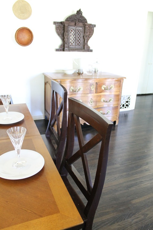
Different tones of wood ranging from dark to light impart an eclectic feel to the rooms.
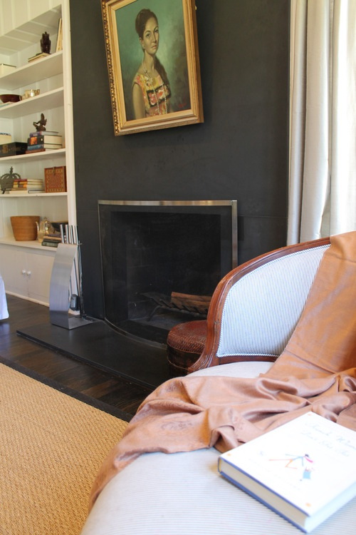
Close up of the settee, book and pashmina.
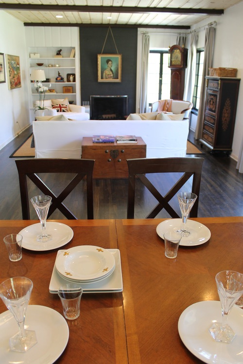
The dining table set for a simple but elegant meal, and the living room beyond
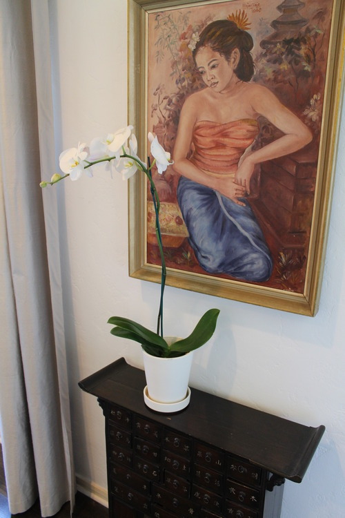
Another vintage original painting at the entry. Below it, a small Asian altar chest. We think the homeowner’s light gray silk draperies add a luxe note to these rooms.
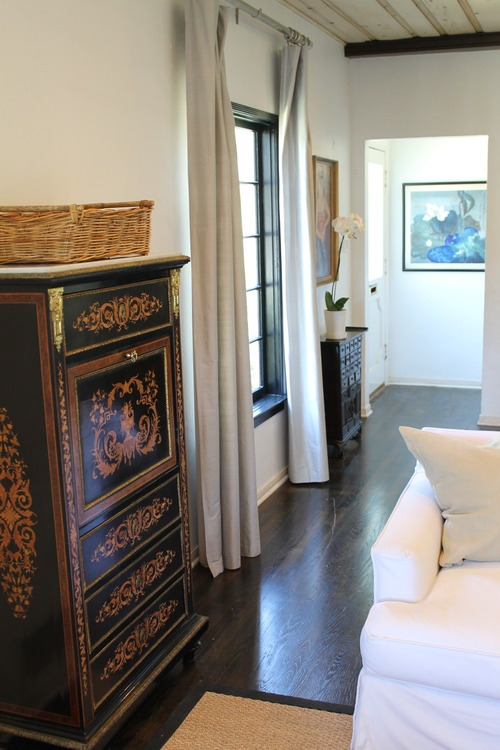
The magnificent Asian chest had previously been where the small altar chest is. We switched their placement for greatest effect and logical space planning. Large pieces in large spaces, and small in small. A large watercolor is placed near the front door. A basket tops the intricate chest for a casual, natural touch.
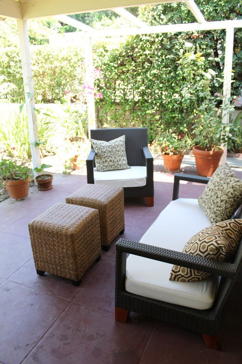
We styled the patio with simple warm tones so as not to compete with the colorful gardens all around it.
