master bath gets a spa treatment
 ur client’s existing master bathroom was such an eyesore, he couldn’t wait for us complete our redesign. In fact, he asked the contractor to paint over the hideous lime green early on in the process. We gladly concurred. The bathroom was a symphony of bad taste — from shiny chrome faucets to white square tiles. In other words, the perfect “before” to our “after”.
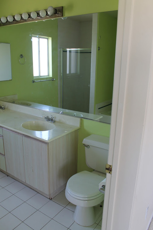
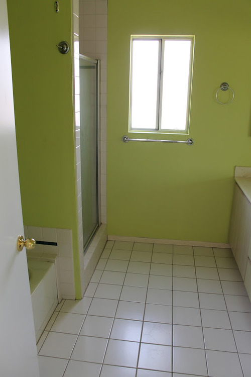
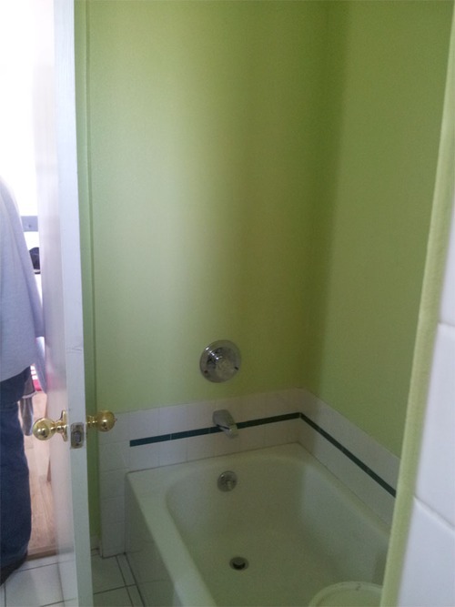
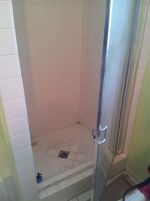
We envisioned a relaxing spa-style retreat with natural elements. Our initial plans included a soft turquoise palette, using glass subway tile as the main focal point and a seaglass tone on the walls. After designing three other rooms in our client’s condo, we began to evolve our design plan toward a more earthy palette. These were the original renderings:
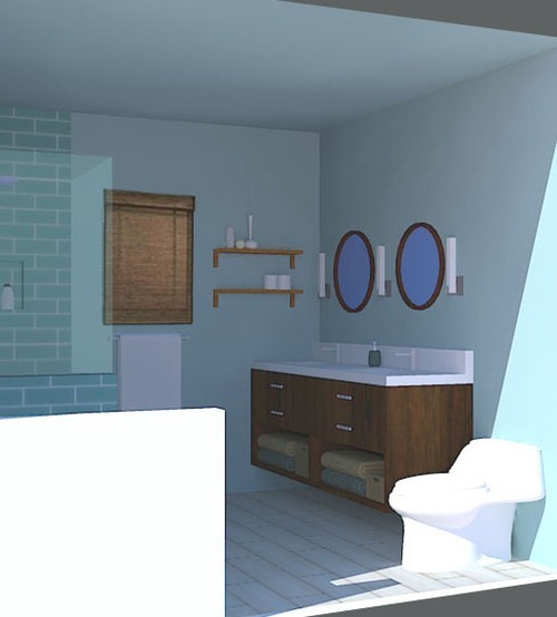
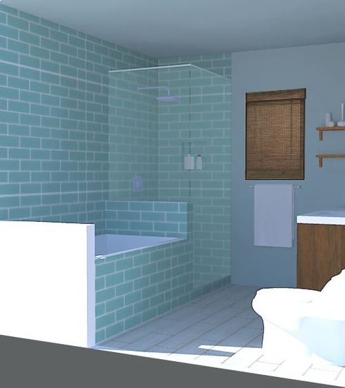
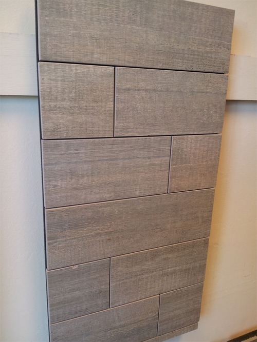
After looking into the cost of glass subway tile, it solidified our decision to go in a different direction. We went back to the drawing board (Floors 4 Less!) with this new criteria in mind and found something even better:
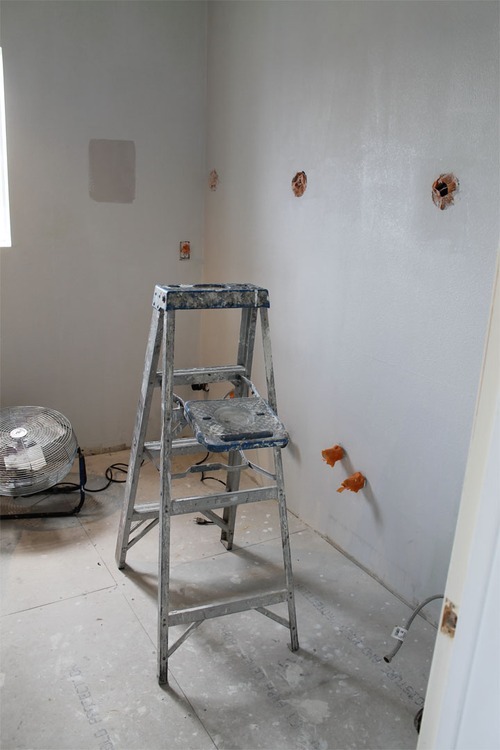
Now comes the fun part! Bye bye bad bath.

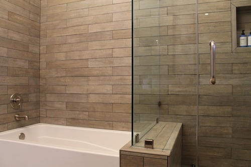
Our weathered wood-look wall tile envelops the bath and shower while a walnut stained double vanity hugs the adjacent wall.

After searching for the perfect round mirrors, we decided on a more masculine shape, and had these two custom made to complement the vanity. Three George Kovacs sconces punctuate the space between the mirrors, and add a sophisticated hotel vibe.
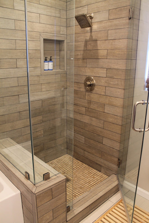
A natural wood bath mat ties into the organic limestone shower floor tile. Moen fixtures in brushed nickel work with the gray tones in the wood-style wall tile.
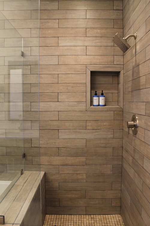
We love that our client has really expensive-looking, beautiful shampoo bottles! They look great in the off-centered niche.
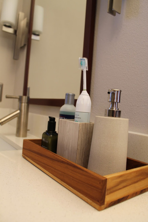
We chose sandstone bath accessories from The Container Store and CB2, and a teak tray to corral them.
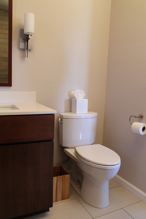
We chose a wall color that picks up on the subtle grays in the floor tile.
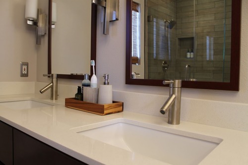
Sleek undermount sinks and a Caesarstone countertop.
