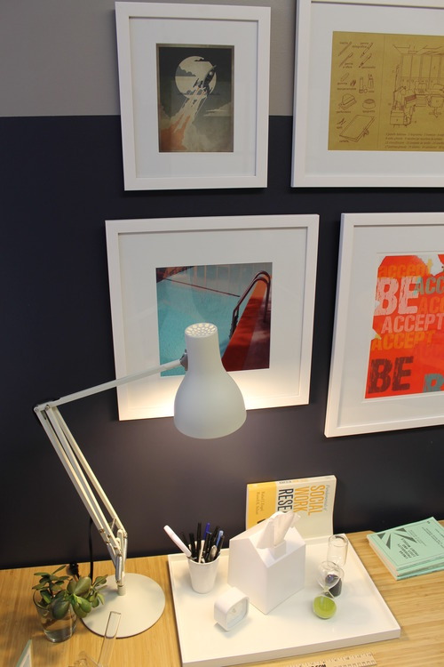
injecting an office with palm springs color and style
 ur client gave us a specific design directive: Make his office feel like Palm Springs. That of-the-moment Jonathan Adler style that mixes bold, colorful elements with masculine hits of metallic for an environment that’s anything but workaday. This office had to be taken seriously — along with its inhabitant. But serious doesn’t necessarily preclude fun. Or a magenta door, for that matter. In this redesign, we completely reworked every surface of this small space to envelop it in warmth, unique personality and vibrancy. It now speaks to its owner’s sophisticated and eclectic tastes, while accommodating his comfort, both during long work days and those late-night-deadline hours.
After the initial consultation with our client, we created a Mood Board showing our overall design direction.The design plan needed to address: 1) his need for light control due to a wall of large industrial windows that flooded the space with harsh light year-round, 2) plain white walls, 3) a place for his set of four hard-earned college diplomas, 4) a way to display original art and prints, 5) alternative lighting to counteract the overhead fluorescent fixtures, 6) a solution to the institutional style linoleum flooring, 7) a way to incorporate his computer monitor into a gallery wall, and 8) unique seating for his guests and visitors.
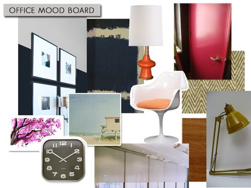
We chose a color scheme of deep, moody navy and gray with orange, magenta, white and gold accents. Benjamin Moore paint in a two-tone stripe, with navy on the bottom 2/3 of the wall and gray on the top 1/3 wraps the room in a soft cocoon. Magenta makes a star appearance on the large door’s interior, making a strong, glossy color statement. A vintage 1960s orange lamp we found on etsy wakes up a corner with soft pools of light. Original watercolors and Instagram style photography also found on etsy pick up the accent colors. We chose teak-finish Allure vinyl flooring to warm the floor and crisp white roller shades for light control that wouldn’t block his view of the trees outside.
We took before photos of the space:
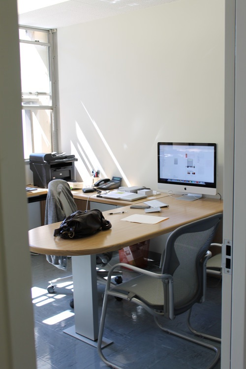
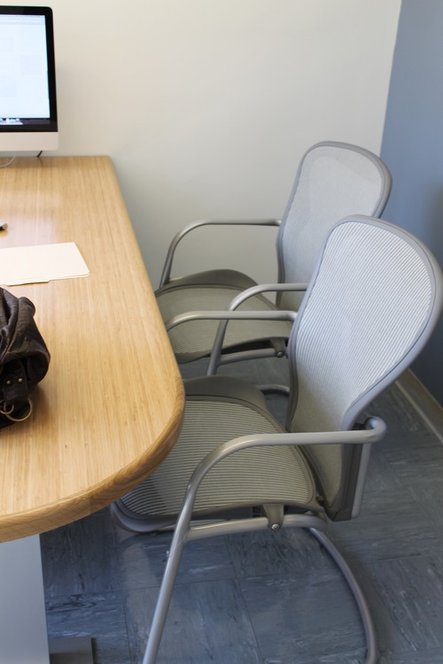
We had to work with our client’s existing bamboo-finish desk. This constraint proved to be a challenge, which we mitigated through the dark navy walls, against which the lightness of the desk would pop. The institutional flooring lacks charm, and a pair of standard office chairs offers no contrast or color.
The next step was to create design renderings to show our client what to expect from the finished design:
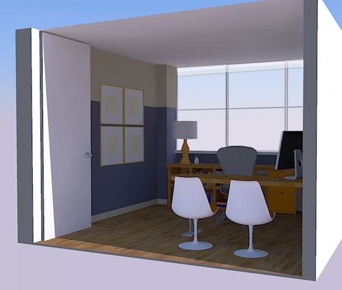
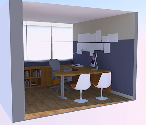
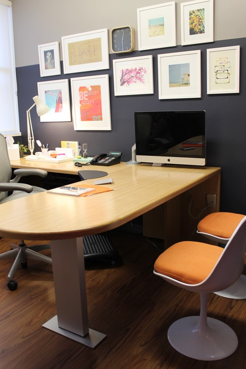
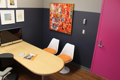
The finished room, showing a gallery wall of curated art from etsy, framed at Downtown Framing Outlet in matching white frames. Two white Saarinen style tulip chairs with orange cushions pop against the navy wall and teak finish floor.
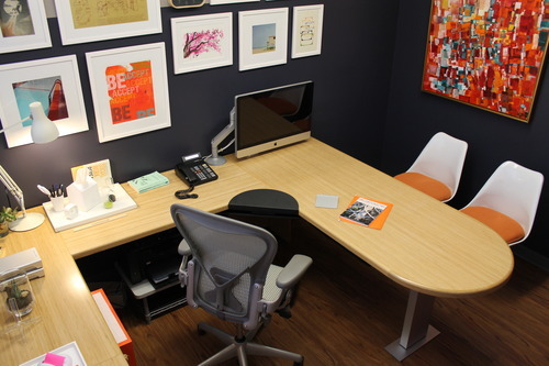
Our client’s Mac monitor is now incorporated into the gallery wall, which includes a wood-framed clock from IKEA.
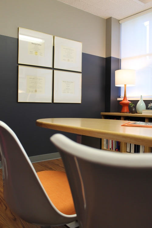
Our client’s four diplomas were framed in narrow gold frames with large white mats and hung in a quadrant for maximum impact. The point where the gray begins in the two-tone wall lines up with the center mullion of the windows for sleek effect. The frames pop just above that line. We had the metal window frames painted white for even more freshness.
An original Kymm Swank abstract on the wall above the tulip chairs. An almost identical painting, also by Swank, appeared in the dining room scenes in Don Draper’s apartment on Mad Men, inspiring our client to want to own an original Swank.
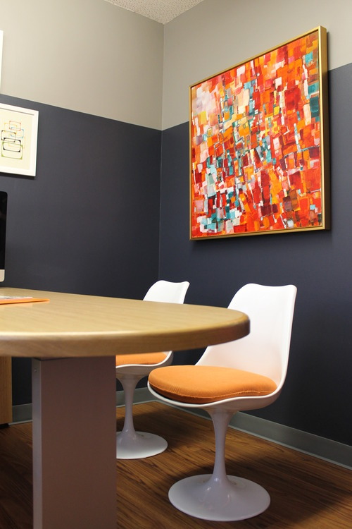
We pulled colors from the painting to accent the office, including the lush magenta on the door.
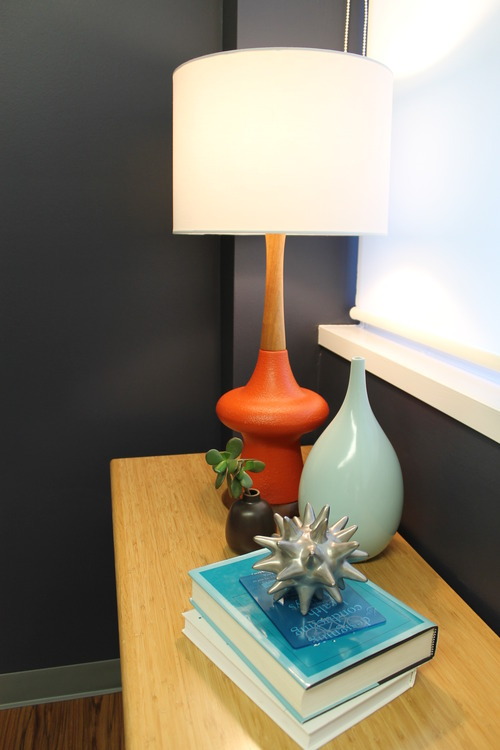
The 1960s lamp glows against the more serious wall color and carries the orange of the chair cushions across the room. Textural, metallic accessories complement the smoother surfaces of the lamp and a light aqua vase.
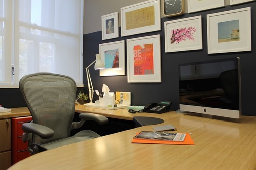
Desk accessories and a gooseneck lamp in white lighten the space, tying into the window treatment and molding. Bright tones in the framed art link back to the vivid abstract on the adjacent wall.
