3/4 bath cleans up nicely
 arwax orange is what we were reminded of when we first laid eyes on this hideous 3/4 bath. Why someone would paint that color in a bathroom, we’ll never know. Our client hired us to redesign this space to coordinate with the other design projects we were tackling in his home. We breathed a great sigh of relief and jumped right in.
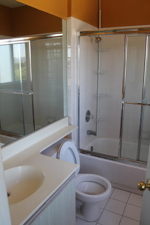
Here’s what we were dealing with:

See? Earwax. An aluminum frame shower door, Home Depot-special shiny white tile and white grout. Add some brass fixtures and one of those extendy-counter-over-the-toilet things and you’ve got a really BLAH bathroom.
Since this is a second bath attached to a guest room, we decided to have some fun. A clean gray palette allowed the introduction of bright colors in towels and accessories. We started off with this rendering to give everyone an idea of the design foundation:

Floating walnut vanity, glassed-in tub/shower combo. Modern Moen fixtures in brushed nickel and a cross-hatch patterned gray wall tile - inspired by a menswear weave, and also reminded us of our client’s J. Crew-heavy wardrobe:

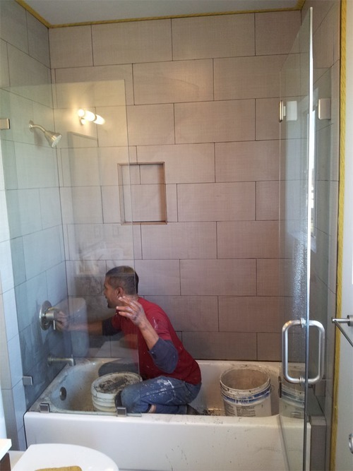
Some in-between shots:


The finished room craved color. After a trip to The Container Store, we emerged with armfuls of bright bath accessories .

We brought in a natural wood bath mat to contrast with the ash-toned floor tile. Sleek Moen shower trim updates the bathtub (which you would never know was reglazed, not replaced!) A simple wire wastebasket tucks in the small space between the Toto Drake II toilet and vanity.

Instagram-inspired photography hangs in brushed metal Crate & Barrel frames. We brought bright orange across the room in the form of hand towels. A brushed nickel framed mirror from West Elm tops out the vanity.

Close-up of shower detail:


