Tulum Airbnb Style Home Staging
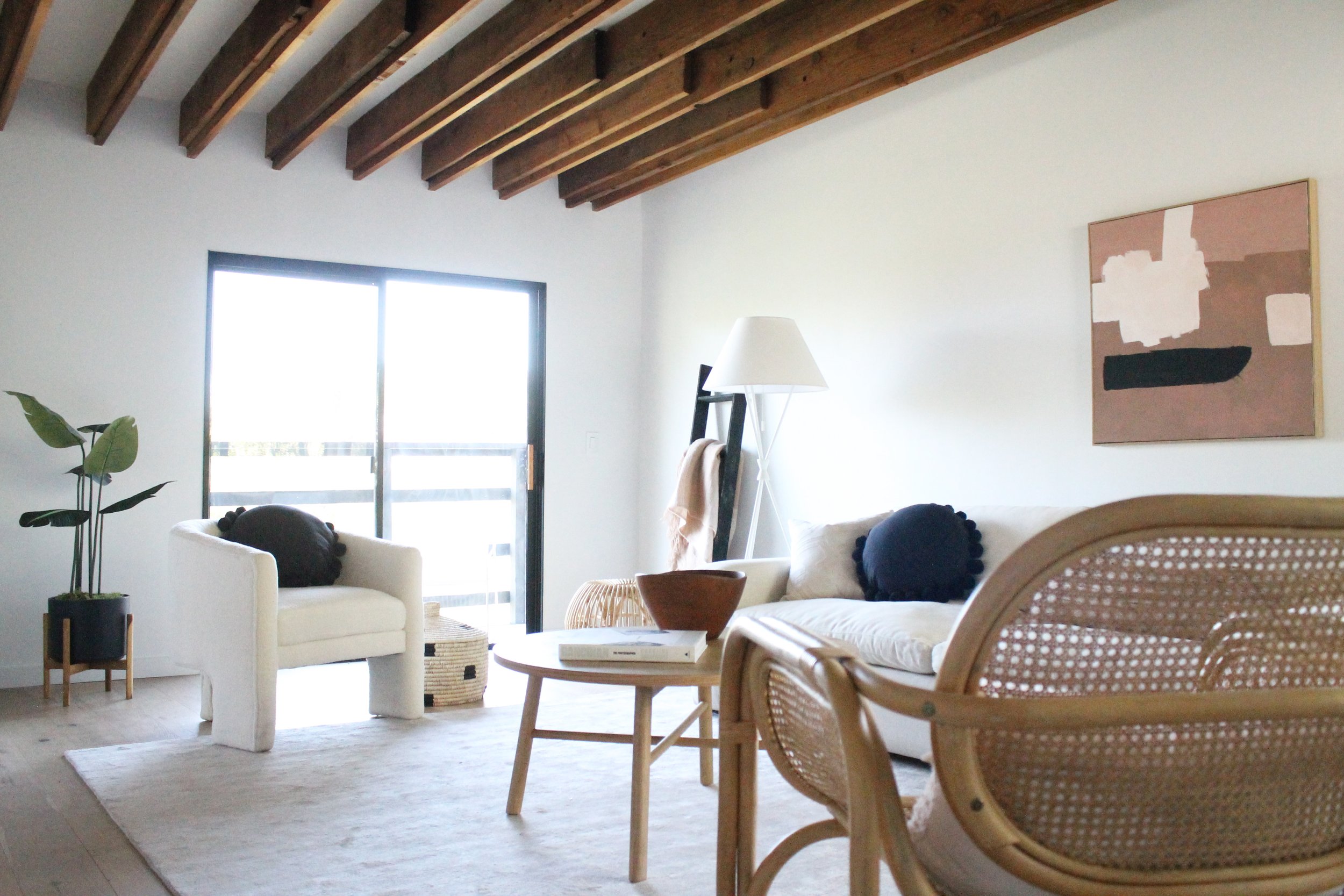
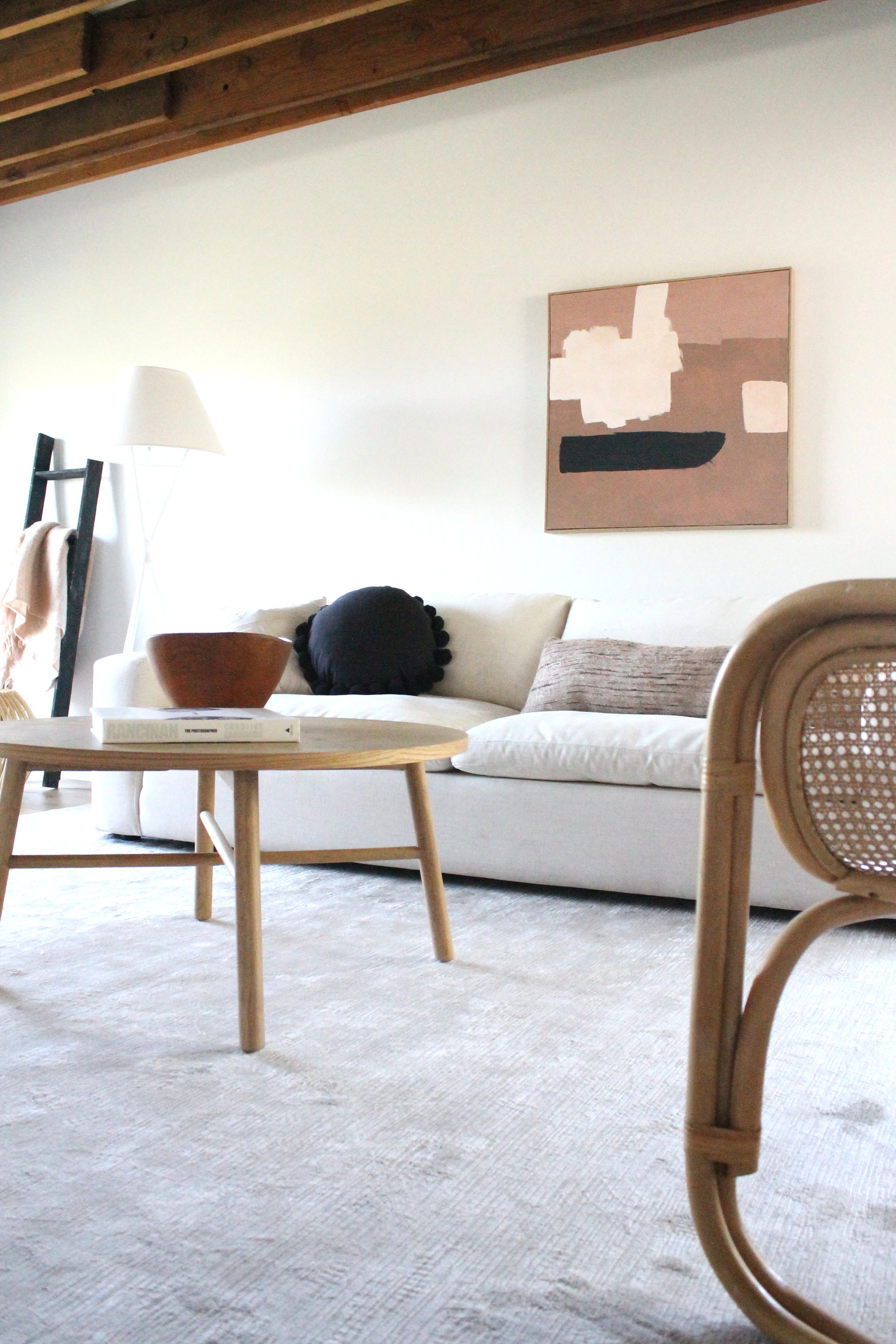
It was a specific request from one of our fave realtor clients. “Can you make the staging look like a hotel in Tulum, Mexico?” We get a lot of requests — and from time to time they are very specific — but this one intrigued us because we’d never been asked to do something quite like this before. What does an AIrbnb in Tulum look like? Well, we took to searching images (and our client provided us with some inspiration pics of their own). Think fresh, open, clean, white, bright, natural. Materials should be light in color and breezy in feel. Surfaces ought to be clear of any extraneous decor items. A single large coffee table book and a rough-hewn wooden bowl. That’s it. One tropical plant in a corner. One eye-catching piece of art (not exactly centered over the sofa). A white boucle chair, a cane chair, a silk rug, a white oak coffee table. We added a handmade lidded basket and ladder with throw. It’s surely an exercise in restraint, hard for a stager to do as we make our living by adding decor to spaces. Sometimes, though, it’s a matter of “addition by subtraction.”
Natural wood-beamed ceilings paved the way for our Tulum-influenced design and white walls opened the door to a minimal approach, staging-wise. Instead of a pile of pillows on the sofa, three artfully arranged pillows of very different sizes and shapes feel more relaxed — and leave room for dreaming, napping and breathing in those (imaginary) tropical breezes
It was a process for us to do this project. It involved shaking up our thinking to simplify, simplify, simplify. That old saying holds true. I would have written you a shorter letter but I just didn’t have the time. Sometimes it takes longer to do less. Wow, somehow there’s a metaphor there for life, isn’t there? White on white with a little natural blush added. A simple Postmodern style floor lamp and a Franco Albini-wannabe side table in the living room exemplify the simplicity of this space.
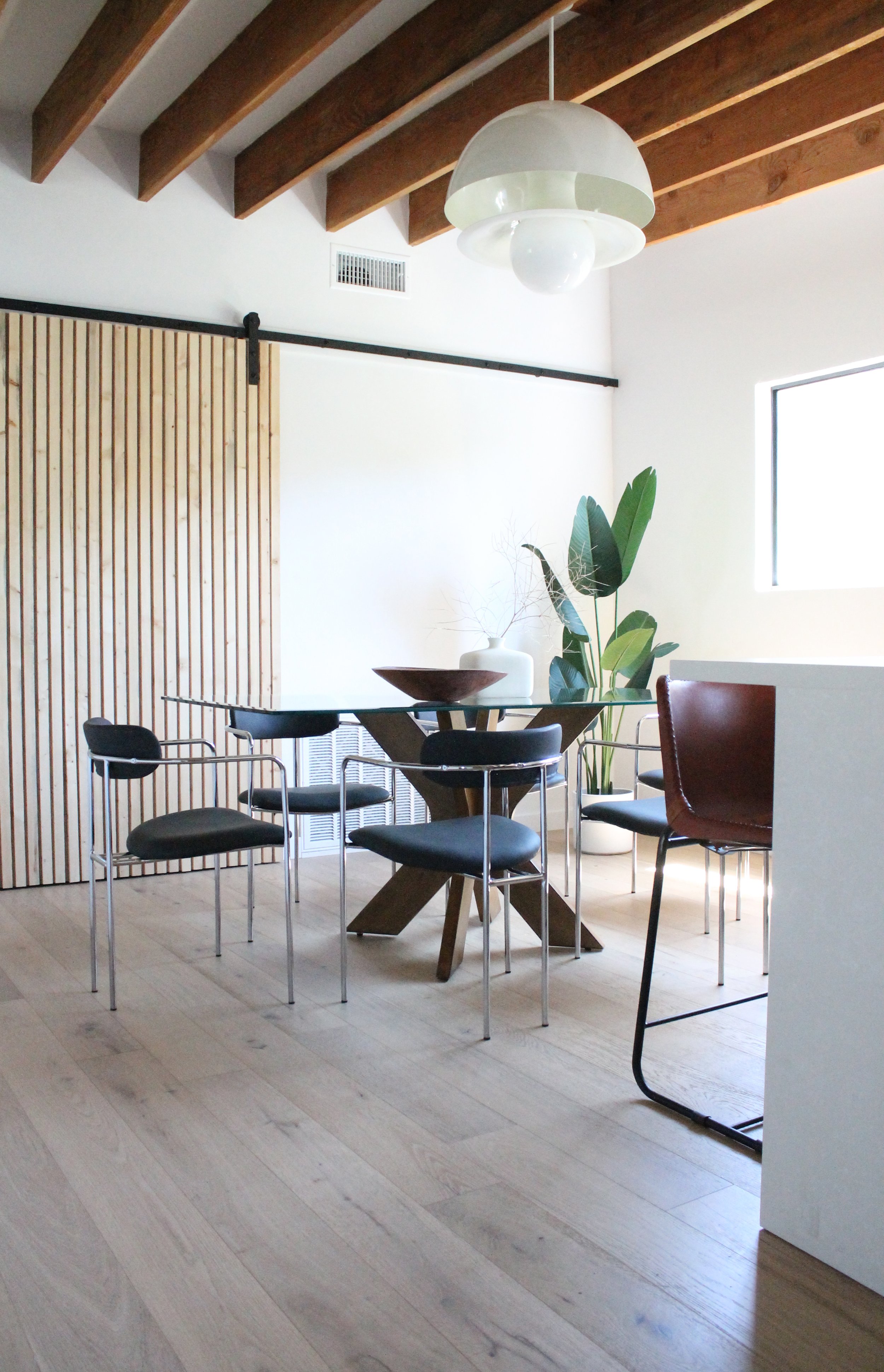
We really wanted to debut these dining chairs in this space, with it’s slat wall barn door, wooden beamed ceiling and cool white pendant. We decided to forgo any sort of rug or cowhide under the dining table so that the delicate lines of the chrome chairs could shine. Two — just two — items on the table. A ceramic vase with a wispy white twig and a rustic bowl. Palm tree in the corner. That’s it.
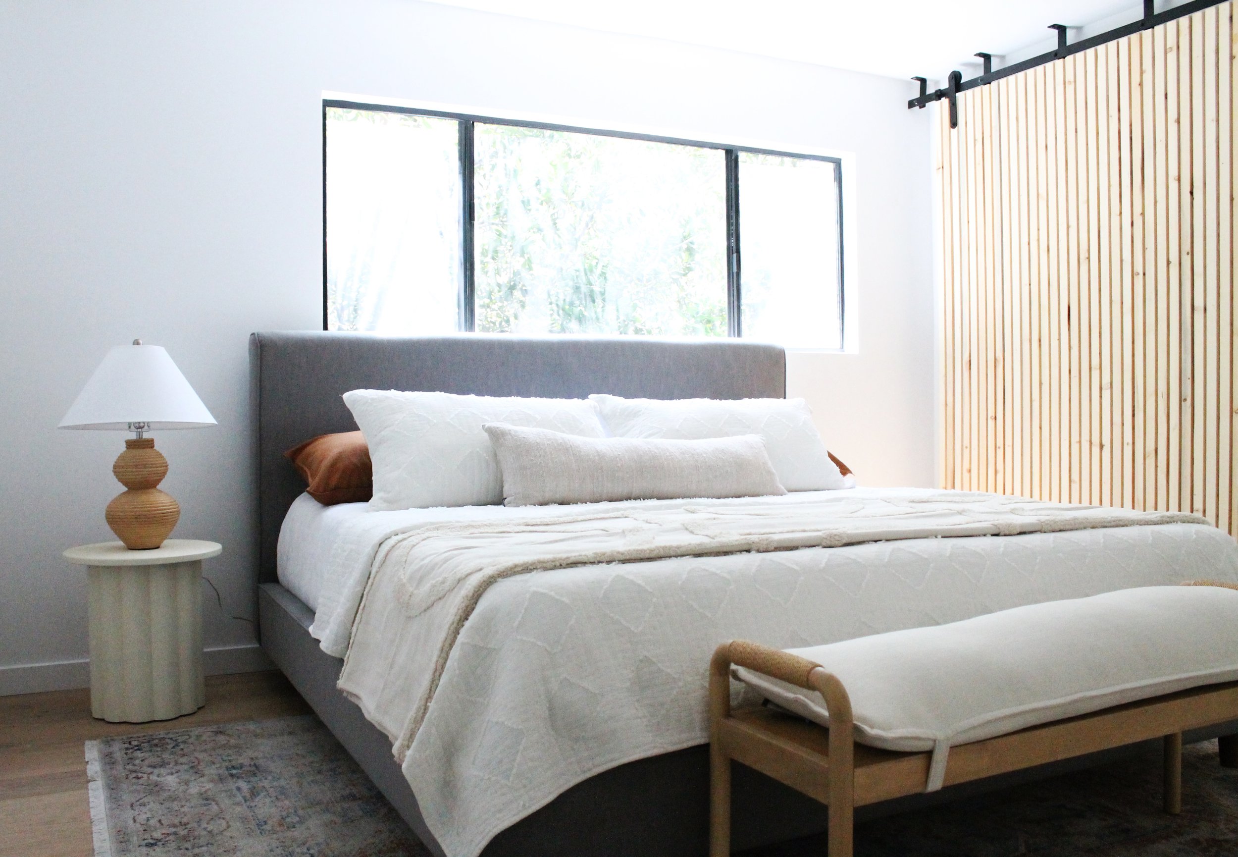
When you keep bed styling simple like this, it allows for some playful patterns on the floor and in your choice of blankets. We had the exact blanket that our client requested so it took center stage in this guest bedroom. A softly patterned fringed rug balances the simple lines of all the other elements in the room. Oh, and that lamp? A great find from our local Habitat for Humanity Restore, sporting its original conical lampshade. What’s a stager to do when suddenly all you want are conical lampshades and you have 29 drum shades in your warehouse?
In answer to the question that you didn’t know you asked? Yes, you can mix stripes of differing widths and visual weights. And don’t forget that little touch of blush. You’re welcome.
The primary bedroom promises peaceful slumbers and a vacation-y feeling year-round. That’s pretty much what this whole style profile is about. We all long to be on vacay, rested and refreshed after about 2-1/2 years of shenanigans, don’t we? I know we do. The curvy lamp gives a nod to tropical style and the white oak bench with linen topper feels fresh at the foot of the bed. Our new favorite end table — a fluted Postmodern one — graces the bedside with no need for its symmetrical twin on the other side.


